
Do you want to boost conversions on your website? As smart marketers know, your design can make all the difference. In this post, we’ll share 11 web design principles that will boost your conversion rate.
Many marketers harp on the importance of SEO, social media, creating lead magnets that convert and the like, yet having an excellent website design to start with is so often overlooked. While all of these components do matter, your web design isn’t just a “pretty face”: it can actually make or break your conversion rates.
According to research from Stanford University, 46.1% of people say a website’s design is the top criteria for deciding if a company is credible or not. So it’s extremely important that your design looks professional.
Whether or not your website is aesthetically pleasing also plays a big role in conversion rate optimization. Given 15 minutes to consume content, two-thirds of people would rather read something beautifully designed than something plain (according to Adobe). So if you want people to read your blog posts, they need to look attractive.
But that’s not all. If your website is unattractive, people will actually leave your site altogether. 38% of people, to be exact. That’s a whole lot of lost leads!
So regardless of whether or not design is your forte, you can’t afford to overlook it. Learn web design, hire a Web design expert, or do whatever it takes!
To start with, here are a handful of important design principles that will give you an immediate and sustainable boost in conversions…
1. Follow Hick’s Law
Hick’s Law is a popular theory that’s cited by a variety of individuals for different purposes but is frequently referenced in terms of web design. Named after British psychologist William Edmund Hick, the law states that the time it takes for an individual to make a decision is directly proportionate to the possible choices he or she has.
In other words, by increasing the number of choices, the decision time is also increased.

You may have heard of the famous study by psychologists Sheena Iyengar and Mark Lepper where they found that a display table with 24 varieties of jam attracted less interest than a table displaying only six varieties of jam. In fact, people who saw the larger display were only one-tenth as likely to buy as people who saw the small display!
That is an example of Hick’s Law in action: action is lost in proportion to the number of choices being presented.
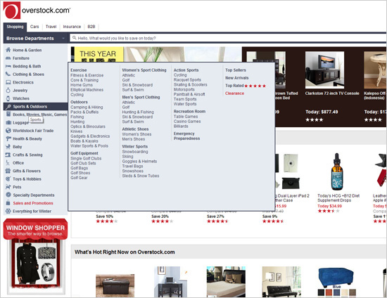
In terms of web design, you can boost conversions by limiting the number of choices users have. The first thing that comes to mind when thinking about where to cut back on the number of choices on your website is the navigation bar. Obviously, you don’t want to have too many links to choose from, otherwise, the user will lose interest in them altogether.
In other words, don’t do this:
However, Hick’s Law doesn’t stop there. Think about all the many different important decisions that users have to make on your website, aside from just which navigation link to press.
Here are just a few:
- Deciding whether to use the navigation bar or scroll down the page more
- Skimming the headlines to see which blog post to read
- Deciding whether to download your lead magnet, share your post on social media, or leave a comment
- Choosing between making a purchase, reading product reviews, or browsing for more products
These only just scratch the surface of the plethora of decisions that your users have to make. It’s normal to feel overwhelmed trying to figure out where to begin cutting back on these decisions, however, there is a simple way to use Hick’s Law in a pinch…
All you have to do is install a full-screen welcome gate on your homepage. A welcome gate covers the entire screen with a single call to action, so the user only sees one choice available at first. If they want to see more choices, they’ll have to scroll down.

This allows you to minimize distractions on your homepage, while still keeping the functionality of your homepage intact.
Overall, when applying Hick’s Law to your website, it’s important for you to know which actions are the most important for your bottom line. For example, do you want users to opt-in for your lead magnet, or do you want them to put a product in their shopping cart? Every page on your site should achieve one main objective.
The more you can limit your user’s choices, the easier your website will be to use, and your conversions will skyrocket.
2. Leverage the Rule of Thirds
The Rule of Thirds is a popular photography principle that can also be applied to web design. With the Rule of Thirds, you’re supposed to visually divide an image (or website page) into thirds (both vertically and horizontally).
This gives you nine equal squares:
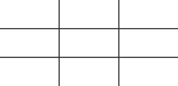
According to the rule, the four middle intersections are strategic places of interest. When objects are placed at these points, it creates the most impactful image or design.

In terms of web design, you can place the page’s most important elements at these intersections to get people focused on them, boosting your conversions.
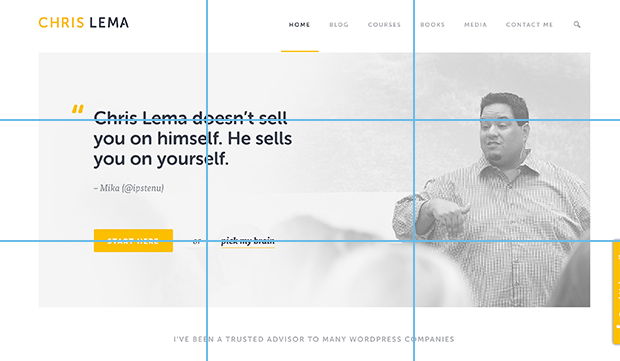
For example, Chris Lema’s homepage has the most important elements (the testimonial and the “Start Here” button) on the two left intersections:
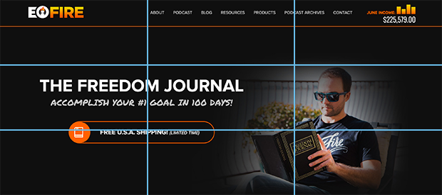
John Lee Dumas’s hero image contains a call to action button right on the bottom left intersection:
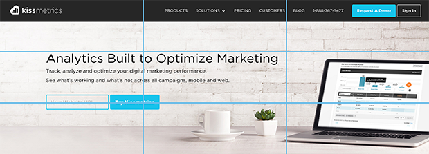
Kissmetrics also places their call to action button at the bottom left intersection:
Notice how none of these websites place their navigation bar anywhere near the intersections. This helps to keep visitors focused on the main call to action on the page, rather than leading their eye to navigate somewhere else.
You needn’t design your entire website strictly by the rule of thirds, rather you can use it as a tool to help you place your most important elements.
Try taking a screenshot of your website (just above the fold or just your header section, not the entire length of the page because nobody looks at a website that way), and divide it up into nine equal squares. Then, you can decide if you want to make any tweaks.
3. Respect Users’ Patience
(Or rather, impatience.) It turns out that people are incredibly impatient, particularly when it comes to surfing the web.
According to a study by the Aberdeen Group, a mere one second delay in page load time results in a 7% reduction in conversions!
So when it comes to page loading speed, every second counts. To check your page speed and troubleshoot any issues, run your site through one or more of these free tools:
4. Use Negative Space
In web design, whitespace is often referred to as negative space. Positive space is the space that contains all the elements on your site, whereas negative space is all of the empty space in between.
Despite the name, negative space is actually a positive thing in web design, because without it your website would be unreadable and unusable.
Negative space doesn’t just refer to the space between the larger elements on your page, such as the space between your header and your content, or space between your sidebar and your content. It also refers to the space between all the smaller elements on your page, like the space between paragraphs, the space between lines of text, and even the space between letters.
Paying attention to all of the forms of negative space on your site serves to keep everything legible, scannable (very important, because that is the way people read websites) and easy on the eyes. And of course, all of this leads to increased conversions.
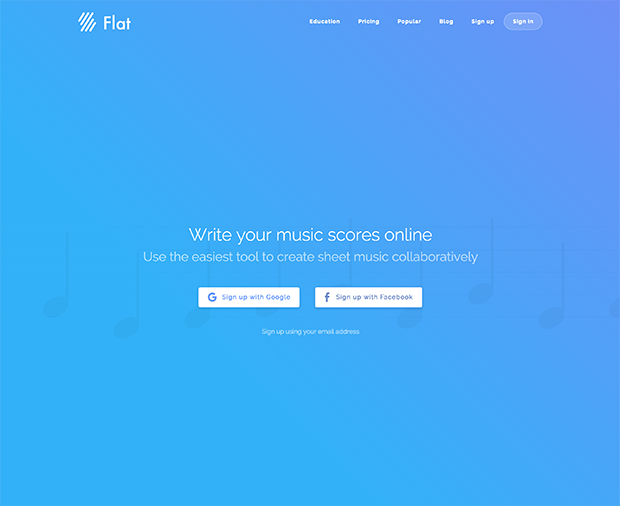
Flat.io uses a ton of negative space on its homepage to keep the focus on their main call to action, which is to sign up with Google or Facebook.
Here are some tips to make sure you are using enough negative space:
- The smaller your font is, the more space you need in between letters.
- Your line-height (defines the space above and below lines of text) should be approximately 150% of the font size for body copy (in CSS, this would read:
line-height: 1.5;).
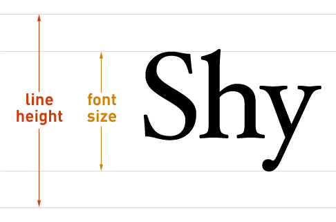
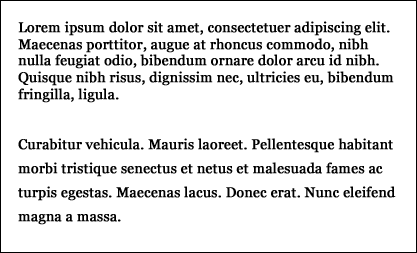
However, smaller fonts need more generous line-heights. Note the difference that a larger line-height makes in the two paragraphs below:
- Break up large blocks of text into smaller paragraphs to increase the negative space in between them and make your blog posts more readable.
- Add white space in between the larger elements on your site (sidebar, header, body, footer, etc.) using ample margins and padding.
5. Consider F-Layout
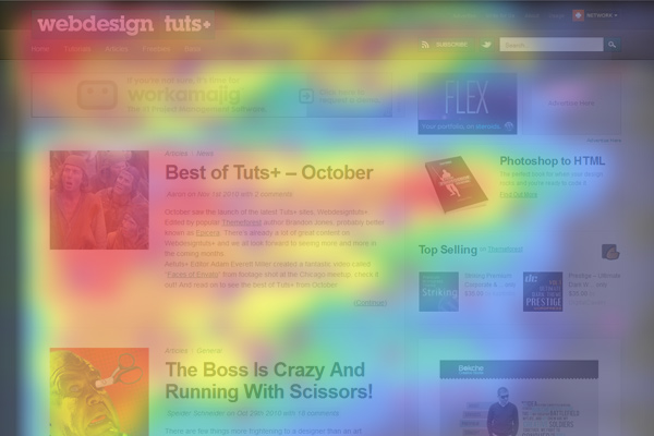
Researchers have found that a user’s natural behavior when browsing the web is to read the screen in an “F” pattern.
Here is a heatmap that shows where user’s eyes typically land on a webpage:
And here is what that looks like as a wireframe:
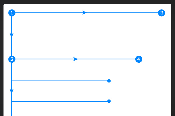
As you can see, people first look from left to right at the top of the screen. Then they scan the page downwards, making small forays into the content. The area of a page that gets the least amount of visibility is the bottom right.
So what does this mean for boosting your conversions? Well, you can take advantage of this behavior by placing the most important objects and calls to action along the F-shape lines, and placing objects of less importance in lower visibility areas.
For instance, you can place your main call to action at the top of the page towards the left-hand side because that is where the user will look first.
Then, if you want your user to stick around to read your latest blog posts, you can place those headlines down the left-hand side of the page. Less important information (such as sponsored ads) can go in the sidebar on the right-hand side of your page, and you can place the information that you want to get the lowest visibility (such as a cookie policy) in the lower right-hand corner of the page.
6. Color Matters
“Colour is an often underrated aspect of web design but it can play a very important role in usability as well as convey the overall meaning of a brand as well as the overall mood of the website,” says designer Tom Kenny. “Different color combinations can evoke different emotions and reactions.”
When choosing a color scheme for your website, make sure to choose a combination that evokes the emotion that you want your brand to convey.
One practical way to do this is by curating a Pinterest board with images that reflect your vision for your brand. Then you can upload a few of those images to Adobe’s Color Wheel using the camera icon on the upper right-hand corner of the screen.
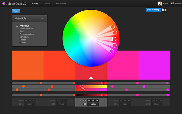
Once the image uploads, it will automatically create a color scheme for you based on the colors in the photo. You can also move the selections around if you want to tweak the individual colors.
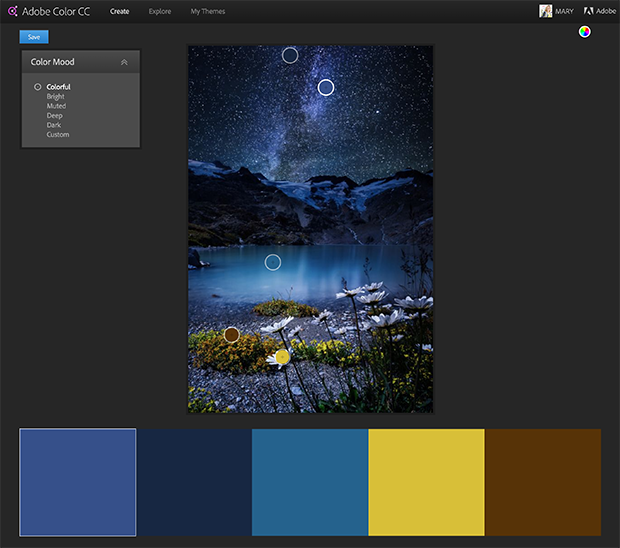
Once you’ve created your color scheme, there is one important thing to keep in mind which will make or break your conversions:
Contrast.
Use contrast to keep text, headlines, and call to action buttons noticeable and readable. In other words, your font and button colors should be in high contrast with the background (e.g. white background with black text), and the elements that you want to highlight (e.g. subscribe buttons) should be in a color that stands out from the rest of your site.
So if we were to use the color scheme we created above, we would want to make shades of blue the predominant color, and use the bright yellow sparingly as a call to action color (since it provides the most contrast).
Let’s look at MailChimp for example. Which elements draw your eye?
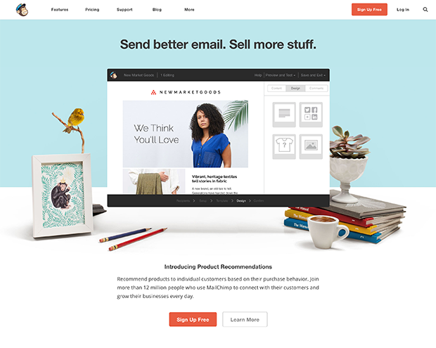
Well, of course, the image in the center with the woman is very eye-catching, however, the two orange call to action buttons are really attention-grabbing. That’s because they are in stark contrast to all the blues on the rest of the page.
7. Remember to K.I.S.S.
You’ve probably heard the “Keep it Simple, Stupid” mantra before. Well, it applies to web design as well.
Simplicity is super important when it comes to driving conversions. Any time you’re creating a page, ask yourself whether there’s a way to make it simpler. The result is usually more aesthetically pleasing, and it almost always converts better.
Remember Hick’s Law? That comes into play here, but simplicity is more than just limiting the options. It’s about creating a clean overall design that is uncluttered and minimizes distractions.
Similar to Hick’s Law is the fact that people can only handle so much information at one time. Visually, if we see too much stuff all crammed into one page, we get overwhelmed and it bothers us. Creating a great user experience on your website means getting rid of anything that isn’t absolutely necessary to the design.
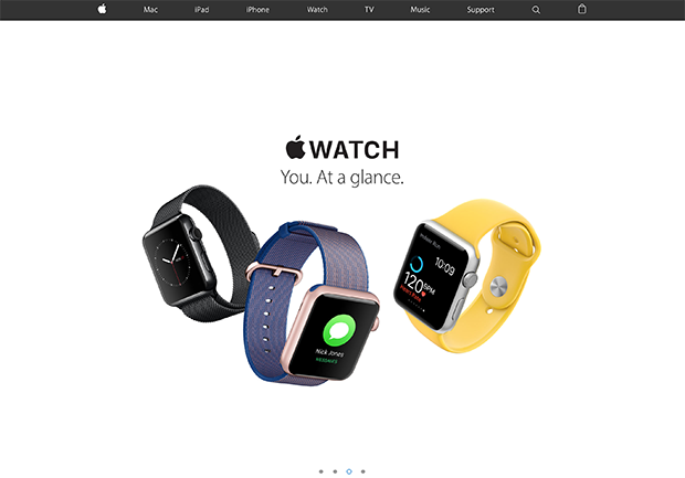
Apple is one of the greatest examples of simplicity in web design, and it is so effective that countless other brands have followed suit.
8. Use the 8-Second Rule
The general rule of thumb is that you have a mere 8 seconds to get a visitor’s attention, because that is the length of the human attention span. (Yes, it’s shorter than the attention span of a goldfish!)
You only have a very tiny window of opportunity to engage a user when they first land on your site, so make those seconds count!
Here are some tips for grabbing attention and boosting conversions within the first 8 seconds:
- Use a large, benefit-driven headline that is brief and to the point.
- Use eye-catching imagery that conveys the main point or purpose of your page and draws the eye towards your main call to action.
- Make signup buttons large, simple and clear.
- Use power words to make your copy more enticing and engaging.
- Incorporate multimedia such as video, audio, or other interactive content.
- Use hover effects on your buttons (e.g. make them change color on mouse-over) to make them more satisfying to click.
- Use animated exit-popups to re-engage visitors who lost interest.
9. Remember the Gestalt Similarity Principle
The Gestalt design principles can be summarized by this one statement from Gestalt psychologist Kurt Koffka: “The whole is other than the sum of the parts.” Basically, the human eye and brain perceive a unified design in a different way than they perceived the individual components of that design.
The first Gestalt principle is the law of similarity, which says that the human eye/brain likes to group similar objects together. It’s a mechanism that allows us to make sense of things, and to organize noisy environments.
In terms of web design, you can leverage this law by grouping items that you want to be associated with one another, such as testimonial boxes, conversion buttons, or images.
For example, if you have an amazing testimonial and you want to use it to boost conversions on your opt-in form, you could place it directly below the form. Even if the testimonial wasn’t written specifically in regard to your lead magnet, the user will associate the two because they are in close proximity.
The law of similarity is also important for the user experience. By grouping all of the main elements of your signup form together (the headline, description, and opt-in button), and keeping them far enough away from the other elements on your page (using negative space), the user’s brain will be able to process the information quicker and more efficiently.
This of course is great for conversions especially because, like we said in the previous point, people have a very short attention span!
10. Use Faces to Increase Familiarity
People love human faces. “When we see a face, we are automatically triggered to feel something or to empathize with that person,” says designer Sabina Idler. “If we recognize content on a website — such as a problem, dilemma, habit or whatever else — we feel connected and understood.”
Make sure to incorporate faces into your articles, case studies and testimonials, opt-in pages, and landing pages for a boost in your conversions.
If you are the face of your brand, this is simple to do. Get a photoshoot done, and make sure the photographer takes plenty of horizontal shots with negative space on one side of you. That way, you’ll be able to place a call to action or some text there.
Here’s an example from Melanie Duncan:

However, if you aren’t the face of your brand, you can still use faces on your website by hiring models or using stock photos. Just make sure the faces you choose represent your brand accurately so that the user will be able to relate to the face.
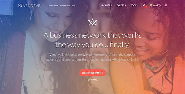
Vendeve, a social network for female entrepreneurs, does a great job of this by using faces that reflect their target demographic:
11. Source High Quality Images
If there’s one thing that can really drag down the quality of a blog post or piece of content, it’s low quality images.
In fact, images can make or break a deal. Bright Local found that 60 percent of consumers are more willing to consider search results that include images, and another 23 percent are more likely to contact a business showcasing an image.
Specifically, you should avoid using lifeless stock photos that are irrelevant and bland. Research from Skyword found that if your content includes compelling images, you’ll get an average of 94% more views!
So instead of using bland images, source high quality photos that develop positive associations with the content and that feel personal. Remember: people like brands that they feel are similar to themselves. If your imagery is too “stuffy” or “corporate”, you’ll turn your visitors away.
Here are some of our favorite places for finding free stock photography that is high quality and personal:
- Pexels
- Death to Stock
- StockSnap
- Unsplash
- Superfamous Studios
- Negative Space
- Gratisography
- Little Visuals
- Picjumbo
- Kaboompics
Now that you understand these 11 web design principles, put them to good use by taking a hard look at your existing design. Which principles are you breaking?
Do you have too many navigation links? Not enough negative space? Or perhaps you don’t have any faces on your site? Many of these problems are quickly and easily fixed with just a few tweaks.


